Dynamic Charts
Contents
[hide]Introduction
Small multiple charts is a term popularised by Edward Tufte. They allow comparing data series as they are repeated for different members.
In XLCubed they are useful for visualising large amounts of data, as hundreds of data points can be plotted and compared easily.
This allows users to find trends and outliers in the data more easily than by trying to study a large table of data.
Video demonstration
For a tutorial, try watching our Small Multiple Videos
UI
As mentioned previously it can be difficult to understand outliers, trends etc when the data is presented as just numbers and text as can be seen below. Using Small Multiples with this example below will guide you through creating meaningful information from the data.
Task Pane: building a set of Charts Example Basic


As you can see the image on the right is a much easier way of viewing the data, compared to the grid.
Let's work through an example.
Category defines the Category (X Axis) within each individual Chart, in this case a Trend over Time


The Series defines the number of data series to be charted.
In order to be able to visualise a simple trend this would be easier with Lines rather than Columns. Use the Chart Type on the Options panel of the Task Pane to change the chart style.


By dragging the Region hierarchy onto columns, and then selecting Children of All, we can split data into separate charts at Region level.
We can additionally split this by Channel by dragging the Channel hierarchy onto rows,
Now we have a graph for each Region by Sales Channel. The Scales (Y axis) are shared so that the charts can be easily compared.
More detail is available for each chart by double clicking on the individual chart eg Direct Sales / Australia Pacific, where the data is unclear because of low numbers can be further explored like this. The scale is automatically adjusted to give a clearer picture of the data. Use the back button to return to the higher level.


Manipulating the chart to show Each Product by Channel, simply drag the Products from the Series to the Rows Below you can clearly see the effect of swapping the Product (Rows) and the Channel (Series)


Additionally you can drive the data selection by using Slicers or Excel ranges.
Here we have defined a Slicer on Time at Year level and used it to drive the Categories.
Small Multiple Chart Designer
Insert a Small Multiples chart by using the Small Multiples option on the ribbon, or the Insert -> Small Multiples Menu option.
After inserting a Small Multiples Chart the above windows will be displayed. The Small Multiples Charts - Task Pane is automatically displayed on the right of the sheet. The Task Pane can also be accessed from the right mouse button pop-up menu.
To delete the Small Multiple chart use the right mouse button pop-up menu -> Delete option.
To Move, Size or Close the Task Pane, drag it using the window bar or use the drop down menu on the Task Pane Header.
The data within the Charts can be refreshed (like a grid) by using the right mouse button pop-up menu -> Refresh option
There is also an initial Warning displayed on the empty chart as it is essential for the design of a Small Multiple Chart set that a Category is selected. This warning can also be seen on the Task Pane.
Display Options
Using some of the other features in the Options section of the Task Panel, charts can be made to display data in order to be able to better view correlations and or outliers
Define the number of Columns Displayed
When selecting the X Axis Children of the Geography we receive the following message, because there more columns returned than the Max Number of Columns defined on the Properties for the Chart. i.e there are 6 values, for Children of Geography.
Wrapping
Alter the Max Charts on Columns to ‘6’ to display all the Geography – Children.
Note the Warning indicator icon in the bottom left corner of the Chart has now disappeared as all the data is displayed.
As there is nothing selected on the Rows, a better way to display this information, given its long narrow nature would be to turn on Chart wrapping.
The data still has a common scale and is more easily compared.
Move the Legend
Using Right Mouse Menu select the position for the Legend, Right, Bottom or None. If None is selected the Legend can easily be retrieved by using the Right Mouse button anywhere on the Chart.
Highlight a Series
Using the Legend series on the Charts can be highlighted, this is useful where series overlap. Here the Reseller Order Count appears brighter. Multiple series can be selected by using Cntl Click.
Drill Into: for a breakdown on the Column


Using the Right Mouse Menu Drill Into the data for Canada, you can continue drilling as far as the Hierarchy allows.
Using the Back button returns to the previous level of Charts
Keep Only: for a closer look at a single Column


Click on the chart you wish to keep and use the Keep Only menu option to remove the other charts
Keep Except: for a closer Comparison


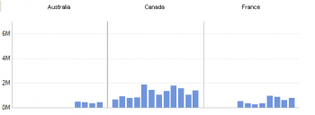
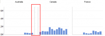
Using this option you can get a closer comparison between two or more Geographies. Here we have removed the United States and Canada, in order to get a better look at how the other Geographies compare to each other. Notice the scales have been adjusted to reflect only the data displayed.
Relationships between Measures
Colour Coding
Colour Coding can be applied to the data points in order to highlight differences. Colour Coding can be applied using the plotted Measure, or another selected Measure. Tick the Colour box in the Options area of the Task Pane; this makes the colour gradient active.


A warning will appear that No Values Hierarchy chosen next to the Values box in the Options area. Drag the hierachy to plot, normally the Measures to the Values box and select the Measure to be plotted ( Y Axis)
Next select the value to apply the gradient to. This can either be the same Measure that is being charted or another measure altogether.


On the left, the Reseller Sales Amount is plotted and Chart coloured based on the Reseller Order Quantity.
On the right, the Reseller Sales Amount is plotted and Chart coloured based on the Discount Amount The colours used for charting can be changed by using the button to the right of the colour swatch.
Here by looking at the Sales Amount, coloured by different values we can see that although there were large volumes of Sales in the USA they were also the most heavily discounted.
Plotting a second Series, using a second Y Axis
It would be useful to view the Order Numbers vs. the Reseller Sales Amounts; if they are both plotted on the same scale it is almost impossible to see the Order Count values as they are so small by comparison. Move to other axis allows you to see two Y Axis scales, one each for Amount and Count.
Using the Right Mouse Menu, whilst positioned on the Legend Entry for the series you wish to move Click Move to other Axis
Scatter Charts: plotting a correlation
Plotting a correlation, using a scatter chart option - firstly define the Y axis and then the X axis against which it is to be plotted. Here we can see how the Sales Amount and Order Count are related - closely in Australia, but spread out in the United States.


In a second example, for selected Geographies, we can apply colour to the chart using a third measure, Discount Amount. Additionally the data is split by Product Category on the rows.
Heavily discounted sales can be seen as red data points.
Using the first example the chart type can be changed to a Bubble. Using the Discount Amount to determine the size of the bubble it can be seen that the greatest discounts occur in the United States.


Drilling through the individual charts, using the Right Mouse can then provide more details as to where the actual sales occur. eg. in Australia, most Sales with high Discounts occur in New South Wales in the Lane Cove area.


Use the back button to navigate back through the previous charts.
Headers: Filtering the Data
By moving the Measures to the Headers you can add to and or change the currently charted measure.
By moving any of the other Hierarchies into the Headers area filters can be applied to the data. eg. Here we are looking at Reseller Sales for just Accessories and Clothing Sales.


Versus Sales for Components below: Components are sold in more locations than the Clothing and Accessories. Note that these selections can be driven from an Excel range or Slicer and could therefore either be preset or selected by the viewer.
Properties
The Small Multiple Chart Properties can be accessed either from the right mouse button pop-up menu -> Properties or from the tool bar at the top of the Small Multiple Charts Task Pane
Colour Palette: Select the Colour Palette for the Chart
Space chart areas: when ticked creates a space between each chart.


Max charts on Columns: the maximum number of Charts displayed in each Column. Max charts on Rows: the maximum number of Charts displayed in each Row.
Note: if the total number of charts exceeds the Number of Rows times the Number of Columns, then some charts will not be displayed. To display them increase either the number or Rows or Columns or both.
When Wrapping charts:
Auto Arrange: XLCubed overrides the Column and Row Counts to give a balanced view of the data. Note: The Column and Row counts still apply as maximums, so if there are not enough spaces the warning message will appear .i.e. if there are 3 columns and 1 row only 3 charts will be displayed, and a warning message given if there are more that number of charts, however the charts will be displayed as a 2 by 2 block.
Fix Column Count: – Uses the Column count first to determine the number of Columns displayed, then display as many charts as possible given the row count.
Category Labels: Determines the display of the Category Labels on the Chart.
Automatic: XLCubed will decide how many labels to display, based on the space available.
Every Category: each category will be displayed regardless of the space available.
Chart Name: the Name of the Chart for easy reference
Column output Cell: XLCubed places the selected value for the Column, in this case the Geography – France into the chosen cell $A$26. This value can then be used to drive other charts, formulas and or grid selections.
Row output cell: XLCubed places the selected value for the Row, in this case the Product Categories – [1] Bikes into the chosen cell $A$27. This value can then be used to drive other charts, formulas and or grid selections.
Colour and Gradient Picker
The colour gradient picker is used to determine both the colours and the rate at which the colour changes.This can have a dramatic effect on the impact on the data being displayed and is a valuable tool for making sure that data becomes information
Here the only change was made to the centre of the colour bar
Chart type
Use the drop-down on chart-type as below to see the many different chart types available within XLCubed for use within Small Multiples graphing.


